移动端flex布局携程网首页案例制作(技术选型,搭建文件夹结构,设置视口标签以及引入初始化样式,常见flex布局思路,背景线性渐变,CSS初始化样式(公共样式,首页样式),首页代码,最终效果)
最新推荐文章于 2024-04-29 09:17:59 发布

程序员shy
 最新推荐文章于 2024-04-29 09:17:59 发布
 阅读量717
 收藏
12
收藏
12
 点赞数
1
点赞数
1
最新推荐文章于 2024-04-29 09:17:59 发布
阅读量717
收藏
12

 点赞数
1
点赞数
1

移动端flex布局携程网首页案例制作
访问地址:m.ctrip.com
技术选型
方案:采取单独制作移动页方案
技术:采取flex布局
搭建文件夹结构
设置视口标签以及引入初始化样式
禁止用户缩放,设置最大最小缩放比例为1.0
<!-- 添加了三个:禁止用户缩放,最大最小缩放为1.0 -->
<meta name="viewport" content="width=device-width, initial-scale=1.0, user-scalable=no, maximum-scale=1.0, minimum-scale=1.0">
<link rel="stylesheet" href="css/normalize.css">
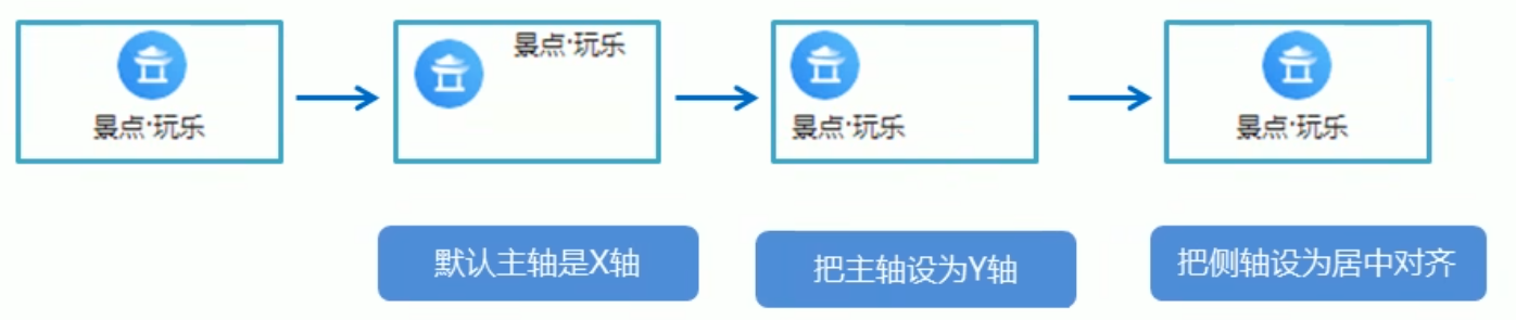
<link rel="stylesheet" href="css/index.css">常见flex布局思路
这样可以实现居中对齐
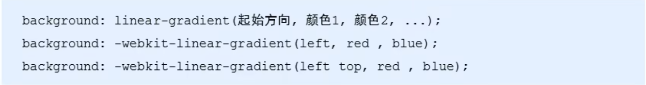
背景线性渐变
背景渐变必须加浏览器私有前缀,起始方向可以是方位名词或者度数,如果省略默认top,一般PC端不用
CSS初始化样式
公共样式
/*! normalize.css v5.0.0 | MIT License | github.com/necolas/normalize.css */

/**
 * 1. Change the default font family in all browsers (opinionated).
 * 2. Correct the line height in all browsers.
 * 3. Prevent adjustments of font size after orientation changes in
 *    IE on Windows Phone and in iOS.
 */

/* Document
   ========================================================================== */

html {
  font-family: sans-serif; /* 1 */
  line-height: 1.15; /* 2 */
  -ms-text-size-adjust: 100%; /* 3 */
  -webkit-text-size-adjust: 100%; /* 3 */
}

/* Sections
   ========================================================================== */

/**
 * Remove the margin in all browsers (opinionated).
 */

body {
  margin: 0;
}

/**
 * Add the correct display in IE 9-.
 */

article,
aside,
footer,
header,
nav,
section {
  display: block;
}

/**
 * Correct the font size and margin on `h1` elements within `section` and
 * `article` contexts in Chrome, Firefox, and Safari.
 */

h1 {
  font-size: 2em;
  margin: 0.67em 0;
}

/* Grouping content
   ========================================================================== */

/**
 * Add the correct display in IE 9-.
 * 1. Add the correct display in IE.
 */

figcaption,
figure,
main { /* 1 */
  display: block;
}

/**
 * Add the correct margin in IE 8.
 */

figure {
  margin: 1em 40px;
}

/**
 * 1. Add the correct box sizing in Firefox.
 * 2. Show the overflow in Edge and IE.
 */

hr {
  box-sizing: content-box; /* 1 */
  height: 0; /* 1 */
  overflow: visible; /* 2 */
}

/**
 * 1. Correct the inheritance and scaling of font size in all browsers.
 * 2. Correct the odd `em` font sizing in all browsers.
 */

pre {
  font-family: monospace, monospace; /* 1 */
  font-size: 1em; /* 2 */
}

/* Text-level semantics
   ========================================================================== */

/**
 * 1. Remove the gray background on active links in IE 10.
 * 2. Remove gaps in links underline in iOS 8+ and Safari 8+.
 */

a {
  background-color: transparent; /* 1 */
  -webkit-text-decoration-skip: objects; /* 2 */
}

/**
 * Remove the outline on focused links when they are also active or hovered
 * in all browsers (opinionated).
 */

a:active,
a:hover {
  outline-width: 0;
}

/**
 * 1. Remove the bottom border in Firefox 39-.
 * 2. Add the correct text decoration in Chrome, Edge, IE, Opera, and Safari.
 */

abbr[title] {
  border-bottom: none; /* 1 */
  text-decoration: underline; /* 2 */
  text-decoration: underline dotted; /* 2 */
}

/**
 * Prevent the duplicate application of `bolder` by the next rule in Safari 6.
 */

b,
strong {
  font-weight: inherit;
}

/**
 * Add the correct font weight in Chrome, Edge, and Safari.
 */

b,
strong {
  font-weight: bolder;
}

/**
 * 1. Correct the inheritance and scaling of font size in all browsers.
 * 2. Correct the odd `em` font sizing in all browsers.
 */

code,
kbd,
samp {
  font-family: monospace, monospace; /* 1 */
  font-size: 1em; /* 2 */
}

/**
 * Add the correct font style in Android 4.3-.
 */

dfn {
  font-style: italic;
}

/**
 * Add the correct background and color in IE 9-.
 */

mark {
  background-color: #ff0;
  color: #000;
}

/**
 * Add the correct font size in all browsers.
 */

small {
  font-size: 80%;
}

/**
 * Prevent `sub` and `sup` elements from affecting the line height in
 * all browsers.
 */

sub,
sup {
  font-size: 75%;
  line-height: 0;
  position: relative;
  vertical-align: baseline;
}

sub {
  bottom: -0.25em;
}

sup {
  top: -0.5em;
}

/* Embedded content
   ========================================================================== */

/**
 * Add the correct display in IE 9-.
 */

audio,
video {
  display: inline-block;
}

/**
 * Add the correct display in iOS 4-7.
 */

audio:not([controls]) {
  display: none;
  height: 0;
}

/**
 * Remove the border on images inside links in IE 10-.
 */

img {
  border-style: none;
}

/**
 * Hide the overflow in IE.
 */

svg:not(:root) {
  overflow: hidden;
}

/* Forms
   ========================================================================== */

/**
 * 1. Change the font styles in all browsers (opinionated).
 * 2. Remove the margin in Firefox and Safari.
 */

button,
input,
optgroup,
select,
textarea {
  font-family: sans-serif; /* 1 */
  font-size: 100%; /* 1 */
  line-height: 1.15; /* 1 */
  margin: 0; /* 2 */
}

/**
 * Show the overflow in IE.
 * 1. Show the overflow in Edge.
 */

button,
input { /* 1 */
  overflow: visible;
}

/**
 * Remove the inheritance of text transform in Edge, Firefox, and IE.
 * 1. Remove the inheritance of text transform in Firefox.
 */

button,
select { /* 1 */
  text-transform: none;
}

/**
 * 1. Prevent a WebKit bug where (2) destroys native `audio` and `video`
 *    controls in Android 4.
 * 2. Correct the inability to style clickable types in iOS and Safari.
 */

button,
html [type="button"], /* 1 */
[type="reset"],
[type="submit"] {
  -webkit-appearance: button; /* 2 */
}

/**
 * Remove the inner border and padding in Firefox.
 */

button::-moz-focus-inner,
[type="button"]::-moz-focus-inner,
[type="reset"]::-moz-focus-inner,
[type="submit"]::-moz-focus-inner {
  border-style: none;
  padding: 0;
}

/**
 * Restore the focus styles unset by the previous rule.
 */

button:-moz-focusring,
[type="button"]:-moz-focusring,
[type="reset"]:-moz-focusring,
[type="submit"]:-moz-focusring {
  outline: 1px dotted ButtonText;
}

/**
 * Change the border, margin, and padding in all browsers (opinionated).
 */

fieldset {
  border: 1px solid #c0c0c0;
  margin: 0 2px;
  padding: 0.35em 0.625em 0.75em;
}

/**
 * 1. Correct the text wrapping in Edge and IE.
 * 2. Correct the color inheritance from `fieldset` elements in IE.
 * 3. Remove the padding so developers are not caught out when they zero out
 *    `fieldset` elements in all browsers.
 */

legend {
  box-sizing: border-box; /* 1 */
  color: inherit; /* 2 */
  display: table; /* 1 */
  max-width: 100%; /* 1 */
  padding: 0; /* 3 */
  white-space: normal; /* 1 */
}

/**
 * 1. Add the correct display in IE 9-.
 * 2. Add the correct vertical alignment in Chrome, Firefox, and Opera.
 */

progress {
  display: inline-block; /* 1 */
  vertical-align: baseline; /* 2 */
}

/**
 * Remove the default vertical scrollbar in IE.
 */

textarea {
  overflow: auto;
}

/**
 * 1. Add the correct box sizing in IE 10-.
 * 2. Remove the padding in IE 10-.
 */

[type="checkbox"],
[type="radio"] {
  box-sizing: border-box; /* 1 */
  padding: 0; /* 2 */
}

/**
 * Correct the cursor style of increment and decrement buttons in Chrome.
 */

[type="number"]::-webkit-inner-spin-button,
[type="number"]::-webkit-outer-spin-button {
  height: auto;
}

/**
 * 1. Correct the odd appearance in Chrome and Safari.
 * 2. Correct the outline style in Safari.
 */

[type="search"] {
  -webkit-appearance: textfield; /* 1 */
  outline-offset: -2px; /* 2 */
}

/**
 * Remove the inner padding and cancel buttons in Chrome and Safari on macOS.
 */

[type="search"]::-webkit-search-cancel-button,
[type="search"]::-webkit-search-decoration {
  -webkit-appearance: none;
}

/**
 * 1. Correct the inability to style clickable types in iOS and Safari.
 * 2. Change font properties to `inherit` in Safari.
 */

::-webkit-file-upload-button {
  -webkit-appearance: button; /* 1 */
  font: inherit; /* 2 */
}

/* Interactive
   ========================================================================== */

/*
 * Add the correct display in IE 9-.
 * 1. Add the correct display in Edge, IE, and Firefox.
 */

details, /* 1 */
menu {
  display: block;
}

/*
 * Add the correct display in all browsers.
 */

summary {
  display: list-item;
}

/* Scripting
   ========================================================================== */

/**
 * Add the correct display in IE 9-.
 */

canvas {
  display: inline-block;
}

/**
 * Add the correct display in IE.
 */

template {
  display: none;
}

/* Hidden
   ========================================================================== */

/**
 * Add the correct display in IE 10-.
 */

[hidden] {
  display: none;
}
首页样式
body {
    /* 缩放最大/最小宽度 */
    max-width: 540px;
    min-width: 320px;
    margin: 0 auto;
    font: normal 14px/1.5 Tahoma, "Lucida Grande" , Verdana, "Microsoftrahei" ,STxihei,hei;
    color: #000;
    background: #f2f2f2;
    /* 隐藏水平滚动条 */
    overflow-x: hidden;
    /* 防止元素点击后高亮 */
    -webkit-tap-highlight-color: transparent;
}

ul{
    list-style: none;
    margin: 0;
    padding: 0;
}

a {
    text-decoration: none;
    color: #222;
}

div {
    box-sizing: border-box;
}

/* 搜索模块 */
.search-index {
    display: flex;
    /* 固定定位,让他一直在屏幕某个位置(脱标) */
    position: fixed;
    /* 同时固定定位必须搭配两个方向的距离 */
    top: 0;
    /* 先向右移动页面的50%,再向左移动自身的50%即可实现居中(固定定位无法使用margin居中) */
    left: 50%;
    /* 兼容老版本浏览器 */
    -webkit-transform: translateX(-50%);
    transform: translateX(-50%);
    /* 固定的盒子必须有宽度 */
    width: 100%;
    min-width: 320px;
    max-width: 540px;
    height: 44px;
    border-top: 1px solid #ccc;
    border-bottom: 1px solid #ccc;
}
.search {
    /* 子绝父相 */
    position: relative;
    height: 26px;
    /* 因为设置了c3的盒子模型,所以实现文字居中要减去上下边框 */
    line-height: 24px;
    border: 1px solid #ccc;
    /* 自适应缩放,同时父亲需要转换为flex */
    flex: 1;
    font-size: 12px;
    color: #666;
    margin: 7px 10px;
    padding-left: 25px;
    border-radius: 5px;
    box-shadow: 0 2px 4px rgba(0,0,0,.2);
}
.search::before {
    content: "";
    position: absolute;
    top: 5px;
    left: 5px;
    width: 15px;
    height: 15px;
    background: url(../images/sprite.png) no-repeat -59px -279px;
    /* 上边是二倍图缩小后的位置,所以下边对应要将缩放后的长宽写上,写一个,另一个会自动缩放 */
    background-size: 104px auto;
}
.user {
    width: 44px;
    height: 44px;
    font-size: 12px;
    text-align: center;
    color: #2eaae0;
}
.user::before {
    content: "";
    display: block;
    width: 23px;
    height: 23px;
    background: url(../images/sprite.png) no-repeat -59px -194px;
    background-size: 104px auto;
    margin: 4px auto -2px;
}

/* 焦点图模块 */
.focus {
    padding-top: 44px;
}
.focus img{
    width: 100%;
}

/* 局部导航栏 */
.local-nav {
    display: flex;
    height: 64px;
    background-color: #fff;
    margin: 3px 4px;
    border-radius: 8px;
}
.local-nav li {
    flex: 1;
}
.local-nav a {
    display: flex;
    /* 主轴设置为Y轴(竖着排列) */
    flex-direction: column;
    /* 侧轴居中对其(因为是单行所以用items) */
    align-items: center;
    font-size: 12px;
}
.local-nav li [class^="local-nav-icon"]{
    width: 32px;
    height: 32px;
    margin-top: 8px;
    background: url(../images/localnav_bg.png) no-repeat 0 0;
    background-size: 32px auto;
}
.local-nav li .local-nav-icon-icon2 {
    background-position: 0 -32px;
}
.local-nav li .local-nav-icon-icon3 {
    background-position: 0 -64px;
}
.local-nav li .local-nav-icon-icon4 {
    background-position: 0 -96px;
}
.local-nav li .local-nav-icon-icon5 {
    background-position: 0 -128px;
}

/* 主导航栏 */
nav {
    overflow: hidden;
    border-radius: 8px;
    margin: 0 4px 3px;
}
.nav-common {
    display: flex;
    height: 88px;
    background-color: pink;
}
.nav-common:nth-child(1) {
    /* 前面加-webkit是浏览器私有前缀,不加可能无法生效,一般PC端不用 */
    background: -webkit-linear-gradient(left, #FA5A55, #FA994D);
}
.nav-common:nth-child(2)
{
    margin: 3px 0;
    background: -webkit-linear-gradient(left, #4B90ED, #53BCED);
}
.nav-common:nth-child(3) {
    background: -webkit-linear-gradient(left, #34C2A9, #6CD559);
}
.nav-items {
    /* 不冲突 */
    flex: 1;
    display: flex;
    flex-direction: column;
}
.nav-items a {
    flex: 1;
    text-align: center;
    line-height: 44px;
    color: #fff;
    font-size: 14px;
    text-shadow: 1px 1px rgba(0,0,0,.2);
}
.nav-items:nth-child(1) a {
    background: url(../images/hotel.png) no-repeat bottom center;
    background-size: 121px auto;
}
.nav-items a:nth-child(2) {
    border-top: solid 1px #fff;
}
/* -代表从后往前,也就是从2开始往前数(因为之前设置了c3盒子模型所以这里不会超出范围) */
.nav-items:nth-child(-n+2) {
    border-right: solid 1px #fff;
}

/* 侧导航栏 */
.subnav-entry {
    display: flex;
    border-radius: 8px;
    background-color: #fff;
    margin: 0 4px;
    flex-wrap: wrap;
    padding: 5px 0 0;
    box-shadow: 1px 1px rgba(0,0,0,.2);
}
.subnav-entry li {
    flex: 20%;
}
.subnav-entry a {
    display: flex;
    flex-direction: column;
    align-items: center;
}
.subnav-entry-icon {
    width: 28px;
    height: 28px;
    background: url(../images/subnav-bg.png) no-repeat 0 0;
    background-size: 28px auto;
}

/* 销售模块 */
.sales-box {
    border-top: solid 1px #bbb;
    background-color: #fff;
    margin: 4px;
}
.sales-hd {
    position: relative;
    height: 44px;
    border-bottom: solid 1px #ccc;
}
.sales-hd h2{
    position: relative;
    text-indent: -999px;
    overflow: hidden;
}
.sales-hd h2::after {
    position: absolute;
    top: 7px;
    left: 20px;
    content: "";
    width: 79px;
    height: 15px;
    background: url(../images/hot.png) no-repeat 0 -20px;
    background-size: 79px auto;
}
.more {
    position: absolute;
    right: 5px;
    top: 0px;
    background: -webkit-linear-gradient(left, #FF506C, #FF6BC6);
    border-radius: 15px;
    padding: 3px 20px 3px 10px;
    color: #fff;
}
.more::after {
    content: "";
    position: absolute;
    top: 11px;
    right: 9px;
    width: 7px;
    height: 7px;
    border-top: 1px solid #fff;
    border-right: 1px solid #fff;
    /* 旋转盒子,默认顺时针,单位是deg */
    transform: rotate(45deg);
}
.row {
    display: flex;
    border-bottom: 1px solid #eee;
}
.row a {
    flex: 1;
}
.row a:nth-child(1) {
    border-right: 1px solid #eee;
}
.row a img {
    width: 100%;
}
首页代码
<!DOCTYPE html>
<html lang="en">
<head>
<meta charset="UTF-8">
<meta http-equiv="X-UA-Compatible" content="IE=edge">
<!-- 添加了三个:禁止用户缩放,最大最小缩放为1.0 -->
<meta name="viewport" content="width=device-width, initial-scale=1.0, user-scalable=no, maximum-scale=1.0, minimum-scale=1.0">
<title>携程旅行</title>
<link rel="stylesheet" href="css/normalize.css">
<link rel="stylesheet" href="css/index.css">
</head>
<body>
<!-- 顶部搜索 -->
<div class="search-index">
<div class="search">搜索:目的地/酒店/旅游/嘿嘿嘿</div>
<a href="#" class="user">我 的</a>
</div>
<!-- 焦点图模块 -->
<div class="focus">
<img src="upload/focus.jpg" alt="">
</div>
<!-- 局部导航栏 -->
<ul class="local-nav">
<li>
<a href="#" title="景点·玩乐">
<span class="local-nav-icon-icon1"></span>
<span>景点·玩乐</span>
</a>
</li>
<li>
<a href="#" title="周边游">
<span class="local-nav-icon-icon2"></span>
<span>周边游</span>
</a>
</li>
<li>
<a href="#" title="美食林">
<span class="local-nav-icon-icon3"></span>
<span>美食林</span>
</a>
</li>
<li>
<a href="#" title="一日游">
<span class="local-nav-icon-icon4"></span>
<span>一日游</span>
</a>
</li>
<li>
<a href="#" title="当地攻略">
<span class="local-nav-icon-icon5"></span>
<span>当地攻略</span>
</a>
</li>
</ul>
<!-- 主导航栏 -->
<nav>
<div class="nav-common">
<div class="nav-items">
<a href="#">海外酒店</a>
</div>
<div class="nav-items">
<a href="#">海外酒店</a>
<a href="#">特价酒店</a>
</div>
<div class="nav-items">
<a href="#">海外酒店</a>
<a href="#">特价酒店</a>
</div>
</div>
<div class="nav-common">
<div class="nav-items">
<a href="#">海外酒店</a>
</div>
<div class="nav-items">
<a href="#">海外酒店</a>
<a href="#">特价酒店</a>
</div>
<div class="nav-items">
<a href="#">海外酒店</a>
<a href="#">特价酒店</a>
</div>
</div>
<div class="nav-common">
<div class="nav-items">
<a href="#">海外酒店</a>
</div>
<div class="nav-items">
<a href="#">海外酒店</a>
<a href="#">特价酒店</a>
</div>
<div class="nav-items">
<a href="#">海外酒店</a>
<a href="#">特价酒店</a>
</div>
</div>
</nav>
<!-- 侧导航栏 -->
<ul class="subnav-entry">
<li>
<a href="#">
<span class="subnav-entry-icon"></span>
<span>话费</span>
</a>
</li>
<li>
<a href="#">
<span class="subnav-entry-icon"></span>
<span>话费</span>
</a>
</li>
<li>
<a href="#">
<span class="subnav-entry-icon"></span>
<span>话费</span>
</a>
</li>
<li>
<a href="#">
<span class="subnav-entry-icon"></span>
<span>话费</span>
</a>
</li>
<li>
<a href="#">
<span class="subnav-entry-icon"></span>
<span>话费</span>
</a>
</li>
<li>
<a href="#">
<span class="subnav-entry-icon"></span>
<span>话费</span>
</a>
</li>
<li>
<a href="#">
<span class="subnav-entry-icon"></span>
<span>话费</span>
</a>
</li>
<li>
<a href="#">
<span class="subnav-entry-icon"></span>
<span>话费</span>
</a>
</li>
<li>
<a href="#">
<span class="subnav-entry-icon"></span>
<span>话费</span>
</a>
</li>
<li>
<a href="#">
<span class="subnav-entry-icon"></span>
<span>话费</span>
</a>
</li>
</ul>
<!-- 销售模块 -->
<div class="sales-box">
<div class="sales-hd">
<h2>热门活动</h2>
<a href="#" class="more">获取更多福利</a>
</div>
<div class="sales-bd">
<div class="row">
<a href="#">
<img src="upload/pic1.jpg" alt="">
</a>
<a href="#">
<img src="upload/pic2.jpg" alt="">
</a>
</div>
<div class="row">
<a href="#">
<img src="upload/pic3.jpg" alt="">
</a>
<a href="#">
<img src="upload/pic4.jpg" alt="">
</a>
</div>
<div class="row">
<a href="#">
<img src="upload/pic5.jpg" alt="">
</a>
<a href="#">
<img src="upload/pic6.jpg" alt="">
</a>
</div>
</div>
</div>
</body>
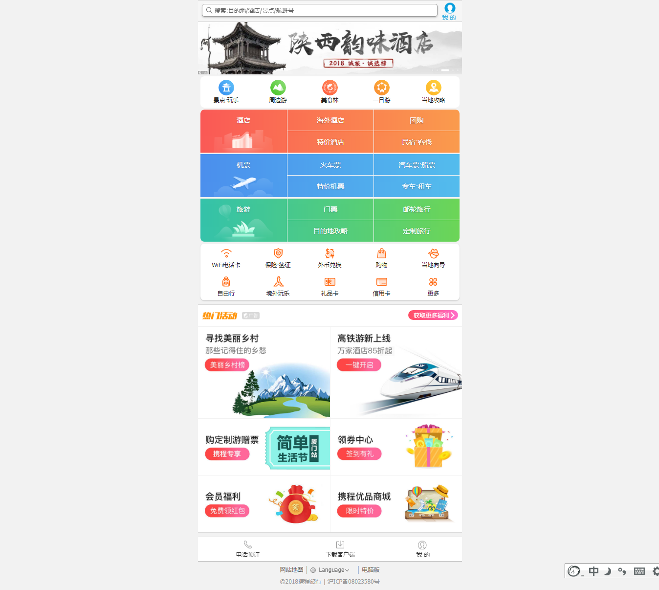
</html>最终效果


 1060
1060


 暂无认证
暂无认证


 到【灌水乐园】发言


拼命の努力!: 行高怎么隐藏了,加上高度有问题
m0_61544264: 有个问题,为什么盒子宽高是18*15,精灵图缩小2倍200px,却可以在这么小的盒子里显示出来呢?
NuanXinWeiyI.: 为啥我用这个 转换的值不准确啊
Sylvianna1: 感谢博主,我下的一直是beta版一直用不了
m0_65560780: 我下载正式版的时候,说什么安全问题不让我解压